Ann Marie Jennings Counselling
Mind and body support. Bridging counselling and holistic therapies
Role
UX/UI Designer
Industry
Mental Health & Wellbeing
Duration
4 months
Context
Project overview
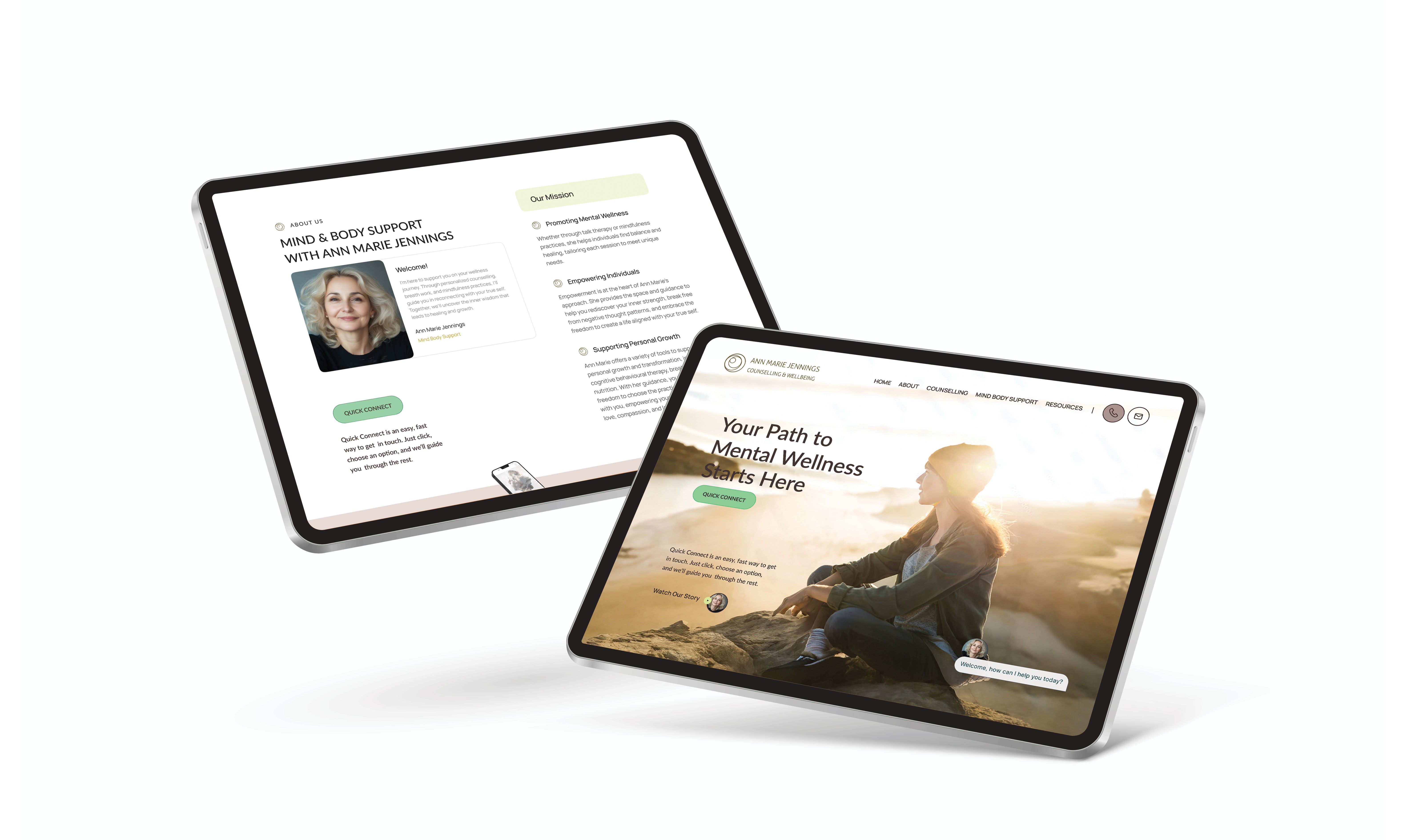
Ann Marie Jennings Counselling is a new startup focused on providing counselling services and holistic support for mental and physical well-being. The project aimed to create a digital platform that reflects the calming, professional, and supportive nature of the services offered, integrated with a cohesive brand identity.
Context
Project overview
Ann Marie Jennings Counselling is a new startup focused on providing counselling services and holistic support for mental and physical well-being. The project aimed to create a digital platform that reflects the calming, professional, and supportive nature of the services offered, integrated with a cohesive brand identity.
Preview of final design

Let's see how I got here

User research
Gathering insights
To gain insights into the target audience and develop a strong brand identity, I conducted:
01 User Interviews and Surveys: Engaged with potential users to understand their needs, preferences, and concerns. Key findings highlighted the importance of privacy, trust, and ease of use.
02 Brand Workshops: Facilitated sessions with the client to define the brand values, mission, and vision. This led to a brand personality focused on empathy, reliability, and empowerment.
03 Competitive and Brand Analysis: Analyzed competitor websites and identified opportunities for differentiation through branding. Explored color psychology, typography, and visual styles that align with the brand ethos of calmness and professionalism.
1
62% of respondents with ADHD or anxiety reported feeling overwhelmed by cluttered layouts and excessive text.
58% of users seeking counseling said they felt anxious about filling out forms and preferred a more human-centric way to book an appointment.
2
47% of users said they would abandon a website if they were asked for personal details too soon. However, 73% said they would share more information if they understood the benefit (e.g., personalized resources).
3
User research - Key findings
The Problem
Preview of final design
Preview of final design
User research
Gathering Insights
By employing the UX triangulation research strategy, I was able to gain deeper insights into customer needs and behaviors in the context of airline websites.
01 Competitor analysis
02 Online Survey
03 User Interviews
I made an Affinity Diagram and Customer Journey Map to identify the pain points and happy interactions to learn from. I then grouped these findings under common themes and features in the platform.
Preview of final design
User research
Gathering insights
By employing the UX triangulation research strategy, I was able to gain deeper insights into customer needs and behaviors in the context of airline websites.
01 Competitor analysis
02 Online Survey
03 User Interviews
With the findings from the above processes, I made an Affinity Diagram and Customer Journey Map to identify and illustrate the pain points and happy interactions to learn from. I then grouped these findings under common themes and features in the platform.
User research - Key findings
The Problem
User research - Key findings
The Problem
1
1
62% of respondents with ADHD or anxiety reported feeling overwhelmed by cluttered layouts and excessive text.
58% of users seeking counseling said they felt anxious about filling out forms and preferred a more human-centric way to book an appointment.
2
2
47% of users said they would abandon a website if they were asked for personal details too soon. However, 73% said they would share more information if they understood the benefit (e.g., personalized resources).
3
3
User research - Key findings
The Problem
User research - Key findings
The Problem
User research - Key findings
The Problem
1
62% of respondents with ADHD or anxiety reported feeling overwhelmed by cluttered layouts and excessive text.
58% of users seeking counseling said they felt anxious about filling out forms and preferred a more human-centric way to book an appointment.
2
47% of users said they would abandon a website if they were asked for personal details too soon. However, 73% said they would share more information if they understood the benefit (e.g., personalized resources).
3
User research - Key findings
The Problem
Personas
Empathizing with the end user

Quick Connect Landing Page: A landing page that prioritizes quick, easy access to services and builds user confidence. Soothing, balanced contrast colors were chosen for call-to-action buttons, avoiding over-stimulation while maintaining visual clarity.
Quick Connect Landing Page: A landing page that prioritizes quick, easy access to services and builds user confidence. Soothing, balanced contrast colors were chosen for call-to-action buttons, avoiding over-stimulation while maintaining visual clarity.
1
Quick Connect Landing Page: A landing page that prioritizes quick, easy access to services and builds user confidence. Soothing, balanced contrast colors were chosen for call-to-action buttons, avoiding over-stimulation while maintaining visual clarity.
Guided Quiz for Personalized Onboarding: Users can complete a 3-question quick quiz to access tailored meditation or breathwork resources, while an additional four questions allow for more personalized recommendations for those seeking in-depth support. This setup balances simplicity with customization, enhancing user engagement.
2
Chat-Based Scheduling Feature: For users feeling apprehensive about formal scheduling, a chat-based system with real-time assistance simplifies the process. This feature aims to alleviate anxiety by allowing users to connect with a human assistant, streamlining their path to booking.
3
Chat-Based Scheduling Feature: For users feeling apprehensive about formal scheduling, a chat-based system with real-time assistance simplifies the process. This feature aims to alleviate anxiety by allowing users to connect with a human assistant, streamlining their path to booking.
Direct Contact and Support Options: Prominent, easily accessible options to reach a counselor, ask questions, or schedule an appointment foster a sense of support, allowing users to quickly establish contact without navigating complex menus.
Direct Contact and Support Options: Prominent, easily accessible options to reach a counselor, ask questions, or schedule an appointment foster a sense of support, allowing users to quickly establish contact without navigating complex menus.
Direct Contact and Support Options: Prominent, easily accessible options to reach a counselor, ask questions, or schedule an appointment foster a sense of support, allowing users to quickly establish contact without navigating complex menus.
4
Exploring solutions
Addressing user pain points
Exploring solutions
Addressing user pain points
Exploring solutions
Addressing user pain points
Information architecture
User flow diagram
The user flow was carefully crafted to prioritize ease of access and minimize decision fatigue:
This flow allows users to seamlessly connect with the right support without feeling pressured or lost.
The user flow was carefully crafted to prioritize ease of access and minimize decision fatigue:
This flow allows users to seamlessly connect with the right support without feeling pressured or lost.
The user flow was carefully crafted to prioritize ease of access and minimize decision fatigue:
This flow allows users to seamlessly connect with the right support without feeling pressured or lost.
Landing Page → Quick Quiz Option or Direct Service Access → Chat Scheduling Feature or Quick Connect

Applied findings
User testing to final design
Facilitated user testing, gathering insightful feedback on the design refinement. This phase was crucial in identifying unforeseen usability issues and validating the effectiveness of the new design elements. Iterative refinements were made based on this feedback, fine-tuning the websites interface to maximize user satisfaction and engagement.
Landing page

Quick Connect
Quiz page

Quiz Page

Conclusion
Reflections
Facilitated user testing, gathering insightful feedback on the design refinement. This phase was crucial in identifying unforeseen usability issues and validating the effectiveness of the new design elements. Iterative refinements were made based on this feedback, fine-tuning the websites interface to maximize user satisfaction and engagement.
This project was an invaluable opportunity to apply UX/UI design principles in a real-world setting, contributing to a product that promotes mental health awareness and supports. It challenged me to think creatively about how to meet user needs and preferences, enhancing my skills in research, design, and collaboration. The experience underscored the importance of user feedback in the design process and the impact of thoughtful design on user engagement and satisfaction.
Other projects
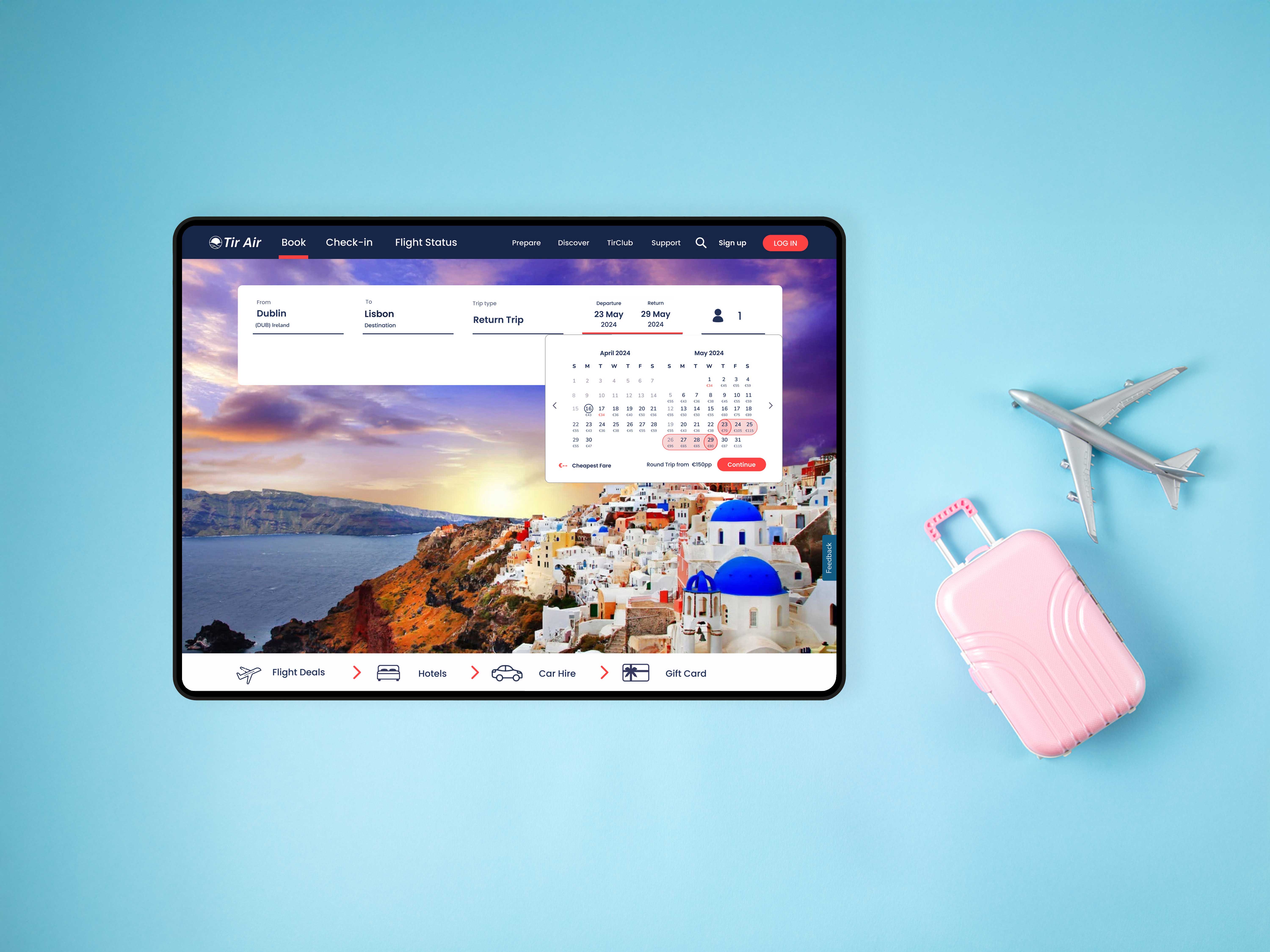
Tir Air
Enhancing the flight booking process for a start-up airline company
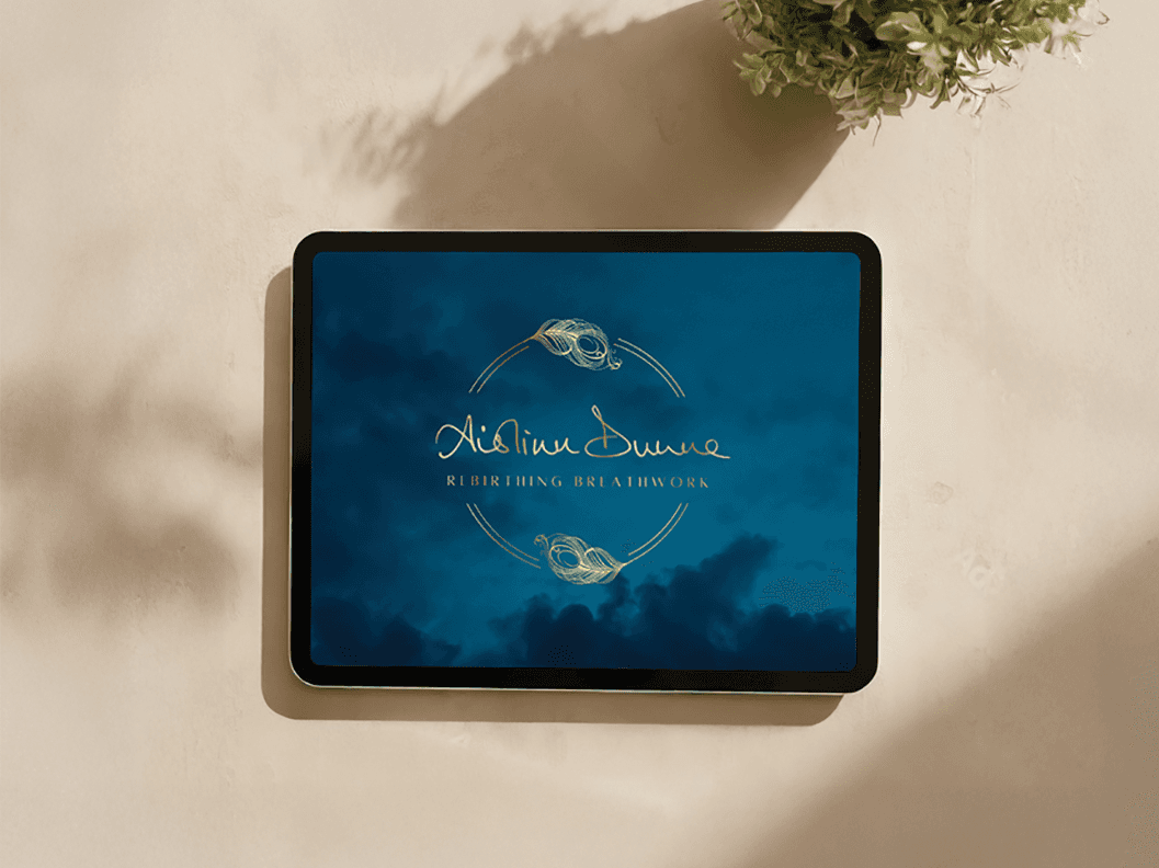
Aislinn Dunne - Rebirthing Breathwork
Bringing a niche practice to a wider audience

UI/UX Design
Interface challenges and industry sector exploration.
Fiona Walsh
Copyright 2024 by Fiona Walsh
Fiona Walsh
Copyright 2024 by Fiona Walsh
Fiona Walsh
Copyright 2024 by Fiona Walsh