Tir Air
Enhancing the flight booking process for a start-up airline company
Role
UX/UI Design
Industry
Air Travel
Duration
5 months
User research - Key findings
The Problem
"What would you change about the website or app?"

1
33% of users found it difficult to find clarity or fully understand their luggage allowance for their selected flight

2
29% of users felt there needed to be
better cost transparency throughout the booking process

3
23% of users felt confused due to a
lack of visual hierarchy for flight information and navigation

4
18% of users would prefer less adds and to feel
less pressured about add ons
Preview of final design
Preview of final design
User research
Gathering Insights
By employing the UX triangulation research strategy, I was able to gain deeper insights into customer needs and behaviors in the context of airline websites.
01 Competitor analysis
02 Online Survey
03 User Interviews
I made an Affinity Diagram and Customer Journey Map to identify the pain points and happy interactions to learn from. I then grouped these findings under common themes and features in the platform.
Context
Project overview
The Tir Air project involved enhancing the flight booking process for a start-up airline company. The focus was on creating a user-friendly and efficient booking experience to meet the needs of modern travelers. This included streamlining the booking flow, integrating intuitive navigation, and ensuring a responsive design across devices. The project aimed to increase customer satisfaction and drive higher conversion rates by simplifying the booking process and reducing friction points.
Context
Project overview
The Tir Air project involved enhancing the flight booking process for a start-up airline company. The focus was on creating a user-friendly and efficient booking experience to meet the needs of modern travelers. This included streamlining the booking flow, integrating intuitive navigation, and ensuring a responsive design across devices. The project aimed to increase customer satisfaction and drive higher conversion rates by simplifying the booking process and reducing friction points.features in the platform.
Context
Project overview
The Tir Air project involved enhancing the flight booking process for a start-up airline company. The focus was on creating a user-friendly and efficient booking experience to meet the needs of modern travelers. This included streamlining the booking flow, integrating intuitive navigation, and ensuring a responsive design across devices. The project aimed to increase customer satisfaction and drive higher conversion rates by simplifying the booking process and reducing friction points.
Preview of final design
Let's see how I got here
User research
Gathering insights
By employing the UX triangulation research strategy, I was able to gain deeper insights into customer needs and behaviors in the context of airline websites.
01 Competitor analysis
02 Online Survey
03 User Interviews
With the findings from the above processes, I made an Affinity Diagram and Customer Journey Map to identify and illustrate the pain points and happy interactions to learn from. I then grouped these findings under common themes and features in the platform.
Affinity Diagram
Affinity Diagram
User research - Key findings
The Problem
User research - Key findings
The Problem
User research - Key findings
The Problem
User research - Key findings
The Problem
User research - Key findings
The Problem
"What would you change about the website or app?"
1
33% of users found it difficult to find clarity or fully understand their luggage allowance for their selected flight
2
29% of users felt there needed to be
better cost transparency throughout the booking process
3
23% of users felt confused due to a
lack of visual hierarchy for flight information and navigation
4
18% of users would prefer less adds and to feel
less pressured about add ons
Personas
Empathizing with the target users
Personas
Empathizing with the target users
To truly connect with the target audience, I find it helpful to develop fictional personas. This approach allows me to step into their shoes and gain deeper insight into their needs, desires, thought processes, and priorities.
Goals
To save money on flights, but will not compromise on experience.
A quick and easy process to browse and book flights.
Save time at the airport by checking-in online and having boarding passes ready in her google wallet prior to travel.
To have more control over add-ons during the booking process.
To spend less time searching for flight deals.
Background
Ciara is a frequent flyer who loves spending time with friends, she travels often to Asia, US and Europe. For a lot of trips, the right dates are more important than price.
Ciara would normally use Skyscanner as a "search place" and then go to individual airline websites to compare prices. Cheapest price isn't always best for Ciara as she feels some flight times can be "unsavory".
Tools


Goals
To save money on flights, but will not compromise on experience.
A quick and easy process to browse and book flights.
Save time at the airport by checking-in online and having boarding passes ready in her google wallet prior to travel.
To have more control over add-ons during the booking process.
To spend less time searching for flight deals.
Ciara Doyle
Ciara Doyle
Pain points
Ciara would prefer less and better placed adds.
Confusion on flight details due to poor layout and visual hierarchy.
Lack of clarity on luggage allowance and associated costs.
Constant pop-ups for add ons during the booking process.
Pain points
Ciara would prefer less and better placed adds.
Confusion on flight details due to poor layout and visual hierarchy.
Lack of clarity on luggage allowance and associated costs.
Constant pop-ups for add ons during the booking process.
Background
Ciara is a frequent flyer who loves spending time with friends, she travels often to Asia, US and Europe. For a lot of trips, the right dates are more important than price.
Ciara would normally use Skyscanner as a "search place" and then go to individual airline websites to compare prices. Cheapest price isn't always best for Ciara as she feels some flight times can be "unsavory".
Goals
To save money on flights, but will not compromise on experience.
A quick and easy process to browse and book flights.
Save time at the airport by checking-in online and having boarding passes ready in her google wallet prior to travel.
To have more control over add-ons during the booking process.
To spend less time searching for flight deals.
Exploring Solutions
Addressing user pain points
Booking a flight should be simple, not stressful. To address user pain points I focused on making the booking process clearer and easier. By improving luggage allowance visibility, displaying upfront flight costs, refining visual hierarchy, and simplifying add-ons, these proposals help create a smoother, more user-friendly experience.
Clarify Luggage Allowance:
To help clarify luggage allowance, carry on and checked luggage allowance is clearly shown within the selected flight field along with tooltips for additional information. The luggage allowance is also identified within the flight summary prior to payment.
Clarify Luggage Allowance:
To help clarify luggage allowance, carry on and checked luggage allowance is clearly shown within the selected flight field along with tooltips for additional information. The luggage allowance is also identified within the flight summary prior to payment.
Clarify Luggage Allowance:
To help clarify luggage allowance, carry on and checked luggage allowance is clearly shown within the selected flight field along with tooltips for additional information. The luggage allowance is also identified within the flight summary prior to payment.
1

2
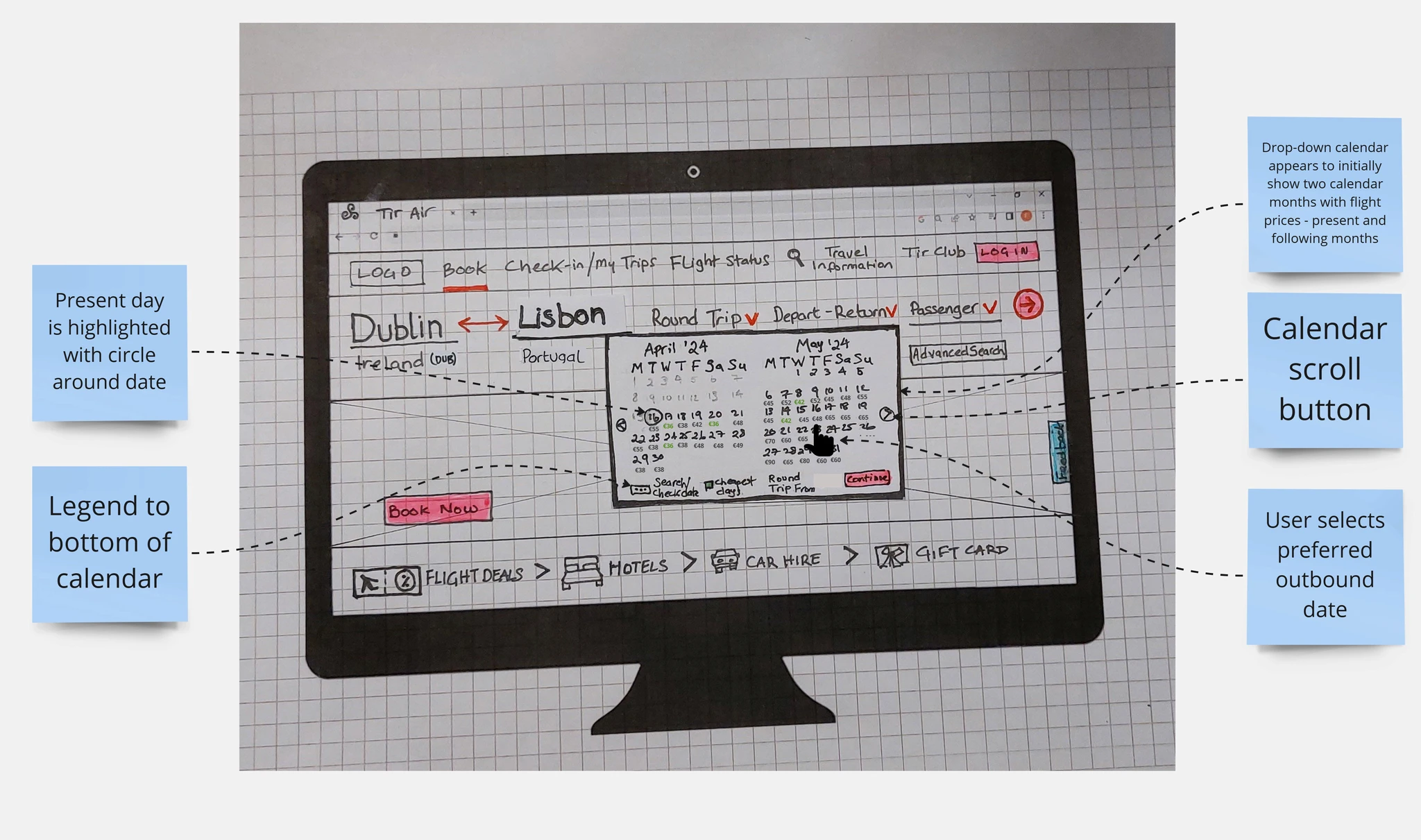
Show initial flight costs within the search calendar:
Including estimated costs below each date within the calendar in the search functionality will allow the user to quickly check approximate flight costs with ease. Flight cost breakdown is also available throughout the booking process.
Show initial flight costs within the search calendar:
Including estimated costs below each date within the calendar in the search functionality will allow the user to quickly check approximate flight costs with ease. Flight cost breakdown is also available throughout the booking process.
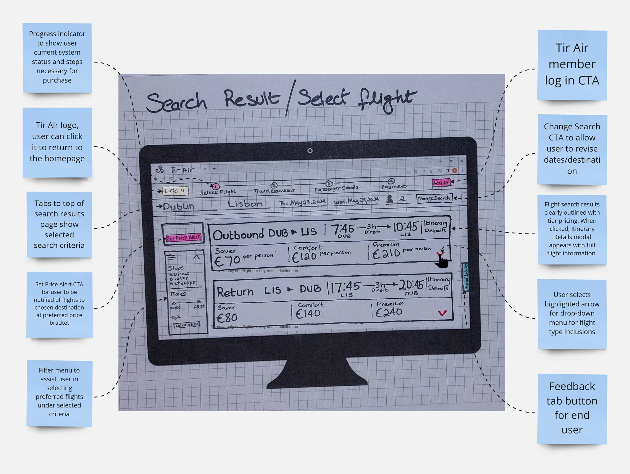
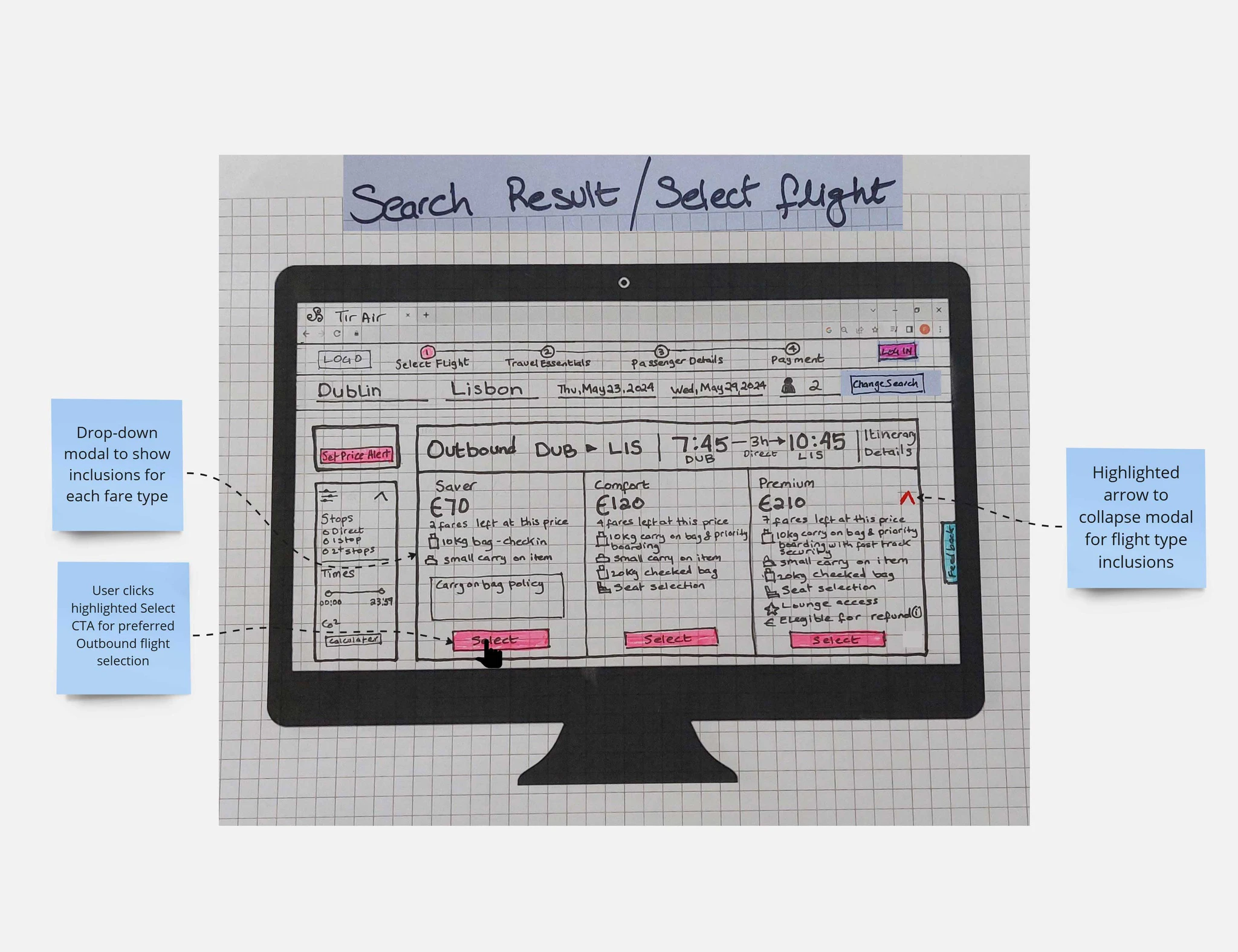
Visual Hierarchy:
Visual hierarchy is practiced through typeface scale and colour. CTA's and chevrons are highlighted with a bright accent colour - red.
Visual Hierarchy:
Visual hierarchy is practiced through typeface scale and colour. CTA's and chevrons are highlighted with a bright accent colour - red.
3
Visual Hierarchy:
Visual hierarchy is practiced through typeface scale and colour. CTA's and chevrons are highlighted with a bright accent colour - red.

Bypass Add ons:
I introduced a Skip Travel Essentials CTA so the user could bypass add ons and be brought straight to the passenger details page. An option to upgrade or add is available prior to payment.
Bypass Add ons:
I introduced a Skip Travel Essentials CTA so the user could bypass add ons and be brought straight to the passenger details page. An option to upgrade or add is available prior to payment.
Bypass Add ons:
I introduced a Skip Travel Essentials CTA so the user could bypass add ons and be brought straight to the passenger details page. An option to upgrade or add is available prior to payment.
4
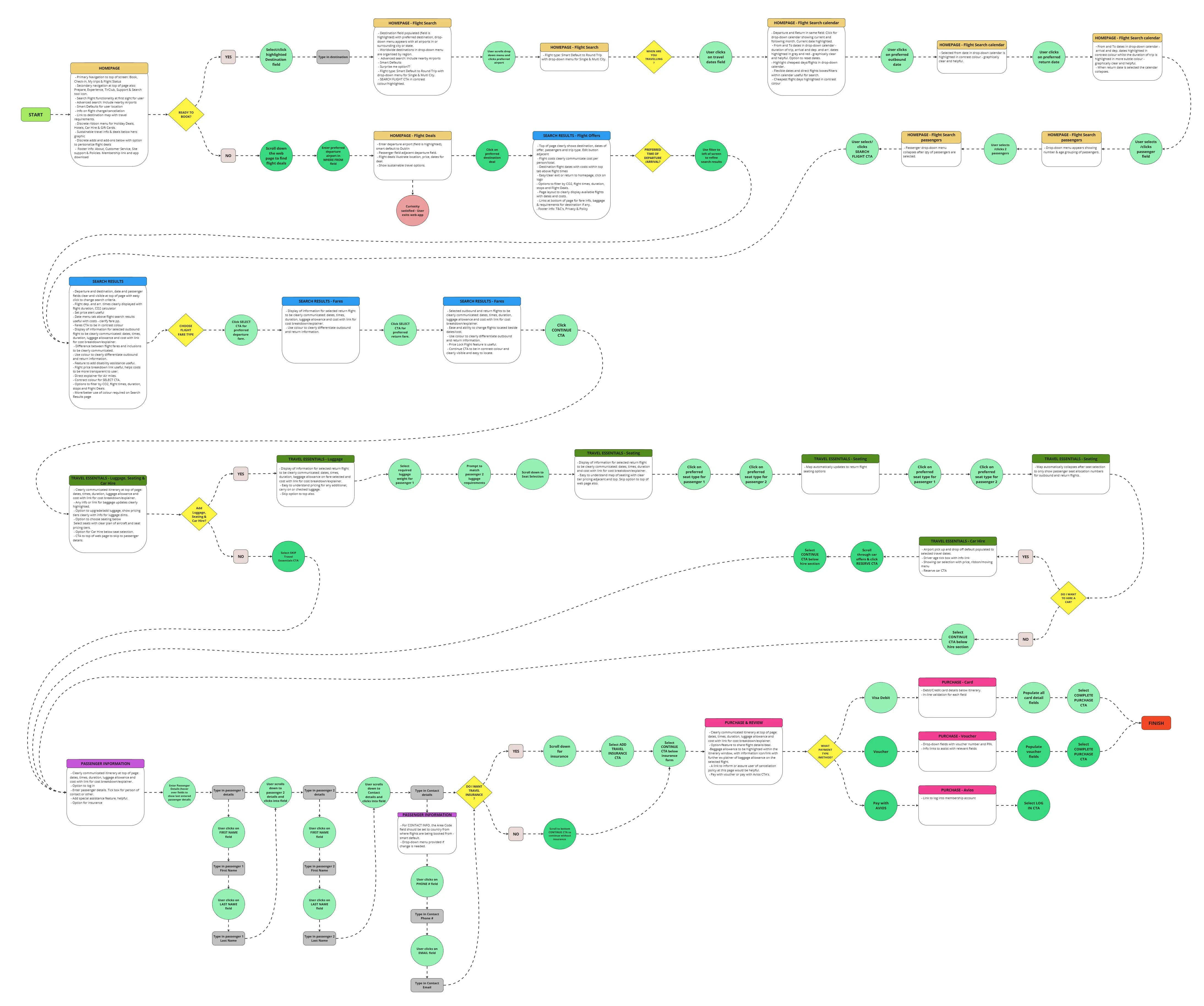
Information architecture
User flow diagram
This user flow for Tir Air maps out a smoother, more intuitive journey—guiding travelers from search to payment with clear steps and minimal friction. Every touchpoint is designed to keep things simple, from upfront pricing to easy navigation, making the booking process feel seamless and stress-free.
Design development
UI design and prototyping
After mapping out the user flow and diving into feedback, I started brainstorming and sketching out ideas for a smoother booking experience. I wanted to tackle the key pain points—like hidden costs, overwhelming choices, and unclear navigation—by creating a more intuitive flow. These early low-fidelity designs helped me refine the journey, making sure users could move through the process with ease, clarity, and confidence.
Applied findings
User testing to final design
Facilitated user testing, gathering insightful feedback on the design refinement. This phase was crucial in identifying unforeseen usability issues and validating the effectiveness of the new design elements. Iterative refinements were made based on this feedback, fine-tuning the websites interface to maximize user satisfaction and engagement.
Tir Air Landing Page
Tir Air Landing Page

Tir Air Search Results Page
Tir Air Search Results Page
Tir Air Search Results Page
Tir Air Travel Essentials Page
Tir Air Travel Essentials Page
Tir Air Travel Essentials Page
Quiz page
Quiz Page
Conclusion
Reflections
The Tir Air project successfully achieved its goal of creating an intuitive and user-friendly booking process, leveraging comprehensive research methods such as competitor analysis, surveys, and user interviews to gain deep insights into user needs. Through an iterative design process, including low-fidelity sketches and high-fidelity prototypes, the team addressed pain points, prioritized clear cost transparency, and minimized intrusive ads, resulting in a streamlined user experience that received positive feedback during testing. The project highlighted the importance of clear information hierarchy, iterative prototyping, and user-centered design while identifying opportunities for improvement, such as optimizing ad placement, incorporating interactive elements, and conducting advanced usability testing. These lessons will guide future projects in delivering impactful and satisfying user experiences.
Other projects
Ann Marie Jennings Counselling
Mind and body support. Bridging counselling and holistic therapies
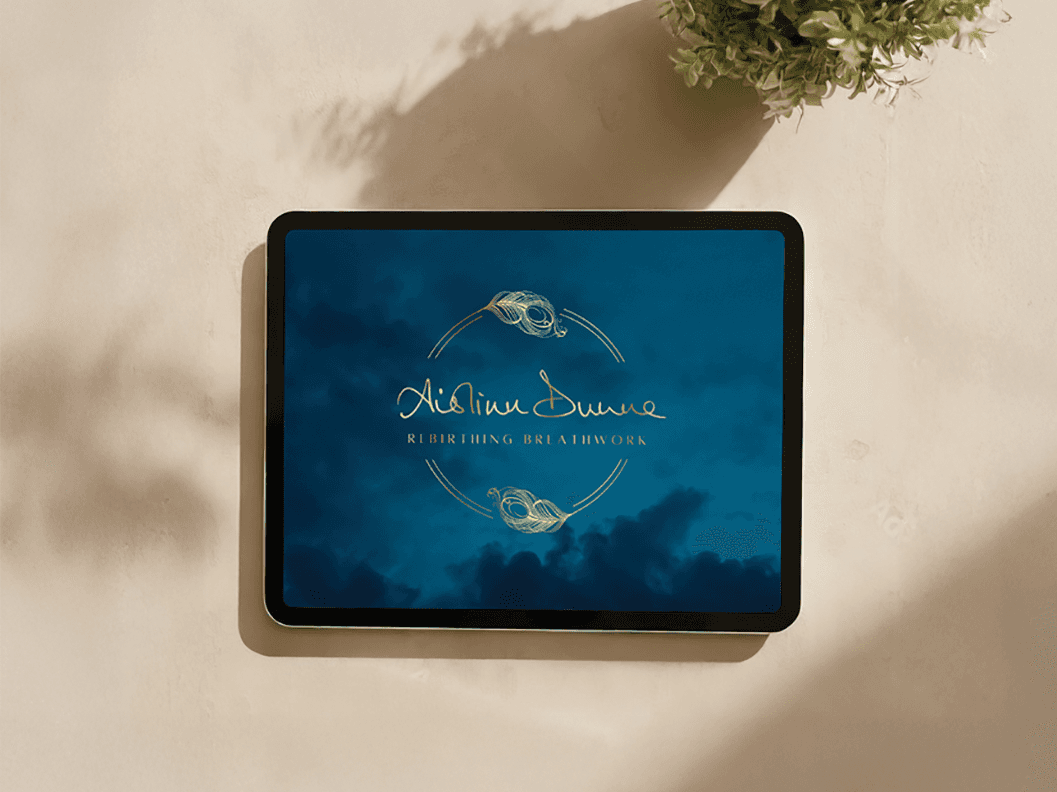
Aislinn Dunne - Rebirthing Breathwork
Bringing a niche practice to a wider audience

UI/UX Design
Interface challenges and industry sector exploration.
Fiona Walsh
Copyright 2024 by Fiona Walsh
Fiona Walsh
Copyright 2024 by Fiona Walsh
Fiona Walsh
Copyright 2024 by Fiona Walsh